My Favourite Album Covers
Beauty can be found anywhere.
// Intro
Nobody cares much about a movie poster once they’ve actually watched the movie. It’s the same for books and video games. A cover doesn’t really matter after you’ve bought the product - as long as it’s not hideous, it’ll do.
Music is different. A song’s cover art stares right back at you every time you listen to it on Spotify or YouTube or whatever. It even creeps into search results and playlists as a thumbnail. And music is designed to be consumed repeatedly. Every time you play or search for a song, you inadvertently get a glimpse of its cover art. Love it or hate it, you can’t ignore it.
A collection of songs released together by an artist is called an album. Back when people purchased albums by paying for CD’s or Vinyl’s (bonkers, I know), cover artwork played a crucial role in determining how many units an album sold.
Since most of us now pay for streaming services instead of individual albums, and since we all have instant access to all the music ever recorded on this planet, ever, one could argue that the commercial value of covers has drastically reduced. Maybe. But I don’t think that makes them any less important artistically. If anything, because of the current ubiquity of music on the internet, album art matters more than ever now, because it makes a project instantly recognizable on any platform.
And album art is invaluable for another, more important reason: it immerses you into the world of an album even before you start listening to it. It’s every song’s first impression with the listener.
It’s especially important for freaks like me, who still listen to complete albums sequentially from start to end. (Common reactions when I give people this information: “You do what?” / “No wonder you’re single.” / “My uncle used to do that and he went insane.” / “Sir, this is a Wendy’s.”) Good album art makes the album itself that much more of an audio-visual journey. It’s a gateway, a portal into a sonic landscape you’re about to explore with the artist. It matters.
(Also, as a musician, if you’ve given up months of your life and poured your soul into recording an album, wouldn’t you want it to have it to have the most awesome cover possible?)
So: because I like album covers so much, I decided to make a list of my favourite ones. (Making lists of things is my third favourite hobby in life, the first two being watching Better Call Saul and rewatching Better Call Saul.) But what makes an album cover great, or even good? For me it’s mostly instinctive: when you know, you know. But if I had to break it down, it comes down to two questions:
First, if I stumbled upon that image completely out of musical context, say, while casually strolling around in an art gallery, would it grab my attention? Would I stop and stare?
Second, does the art compliment the album’s music? Does it match the vibe?
When it comes to my favourite covers, the answer is a resounding “Hell yeah!” in both cases. Of course, these questions are necessary but not sufficient conditions. There’s a certain magic to art that can’t be quantified or broken down. You just feel its beauty.
But that’s really all I thought about when making this list. I didn’t much care about a particular cover’s influence or historical significance in the music landscape. Iconic artworks of records like Nirvana’s Nevermind, Pink Floyd’s Dark Side of the Moon or The Beatles’ Abbey Road didn’t make it here, because if I saw any of them out of context I wouldn’t pay them too much attention. I also didn’t include any Hindi soundtrack covers because they’re usually rehashes of movie posters. So the list consists mostly of English and American stuff.
In that spirit, below is a collection of my favourite album art, listed chronologically by the albums’ release dates.
I’ve also added a link to my favourite song from each record, in case you fall in love with the art and want a taste of the music.
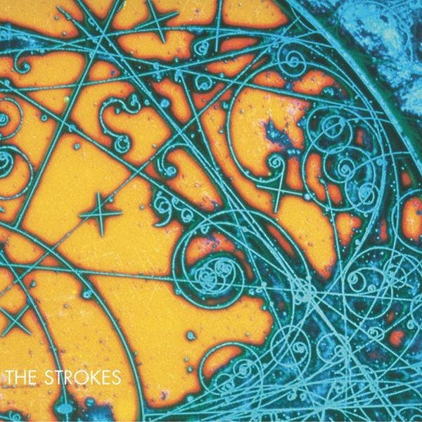
The Strokes - Is This It (2001)
We start the list off with the most stunning artwork of them all. Wikipedia tells me that this is “a psychedelic photograph of subatomic particle tracks in a bubble chamber.” I don’t know what any of those words mean. What I do know is that I could stare at this baroque, beautiful picture for hours.
The fact that the album’s title track is one of my favourite songs ever just makes me like the cover more. Or is it the other way round?
Either way, there is something magical about the whole thing. The yellow-blue combination, the detailed, intricate design, the liveliness of the colours - just looking at it makes me feel like I’m having a religious experience. It’s transcendent.
Favourite song: Is This It
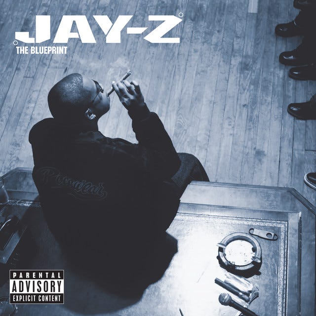
Jay-Z - The Blueprint (2001)
Paying homage to this iconic photo of a British gangster, the cover for Jay-Z’s 2001 opus is the embodiment of badassery, class, and style.
Everything about this slaps, from the blue tint to the way Jay-Z seems to have the world at his feet. The album sounds like a classic before you’ve even listened to it. No rapper has looked more at ease on their sleeve, before or since.
Favourite song: Renegade (feat. Eminem)
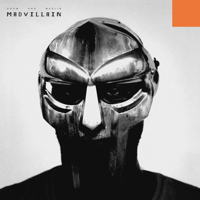
Madvillain - Madvillainy (2004)
This is an image that does so much with so little. MF Doom makes his formidable presence felt before you’ve even played track one. You somehow know this is not going to be a pop album. The use of the mask, the grayscale lighting and shadows, the red square - it all adds up to an arresting image that is impossible to look away from.
Favourite song: Accordion
Kanye West - Graduation (2007)
Bringing the educational theme of Kanye West's first two albums to a close in style, both the cover and music of Graduation convey a sense of jubilance, celebration, and new beginnings.
There’s a million reasons I love this art. Namely:
a) It’s drawn with a rich level of detail and uses colours gorgeously.
b) Cartoon animals!
c) It’s remarkably animated (in every sense of the word) for a rap album cover, which tend to have a serious, ostentatious, egotistic vibe even at their best. (See the two entries above.)
d) It’s perfectly in tune both with Dropout Bear’s graduating trajectory, and with the album’s grander, cheerier, electro-stadium-arena version of hip hop.
And there’s just so much going on in the image when you look at it closely: a spruced up cartoon bear (!) is being shot into the sky out of a laser-cannon (!!) from an anthropomorphic university building (!!!) on his graduation day. If that’s not awesome, nothing is.
Favourite song: Stronger
Kanye West - 808s & Heartbreak (2008)
How do you follow up three wildly successful rap albums? Why, you make a melancholic auto-tuned R&B record, of course.
The death of his mother and the subsequent breakup with his fiancé, both within a year after the release of Graduation, marked a painful time for West. 808s is the artistic embodiment of that time, so it’s no surprise that the album is also one of the wildest musical departures I’ve seen any artist make, let alone a rapper. Nobody expected Kanye to come up with anything like it.
Both the album and its cover articulate Kanye’s anguished state of mind beautifully. Gone are the bright colours, the Dropout Bear, the usual distinct bravado of his previous releases. All you have here is a beaten down heart in the center of bland greyness, and some pastel coloured swatches to the side. The idea of using a red deflated balloon as a heart seems so obvious, yet is so well done. The grey, minimalist design evokes a sense of vulnerability and emptiness, and is perfect for a record as introspective as this one.
Favourite song: Heartless
// Kanye’s Art (Interlude)
Kanye West often gets labelled as self-absorbed, arrogant, and narcissistic. (That’s because he is.) But it’s quite fascinating to me that in his ten studio albums, he’s never once added his face on any album cover, despite being one of the most recognizable personalities in music.
And consider the fact that as an artist, having your photo on your own project’s cover is not just common, but has been a universal practice since decades and across genres, especially in hip hop. This is not even a bad thing! You’ll find many examples in this list itself.
But Kanye has resisted the temptation to use his celebrity to further his art. He’s always gone the extra mile to make great covers that represent an idea, or match a particular vibe, and the two albums above (and one more to come later) are perfect examples of this.
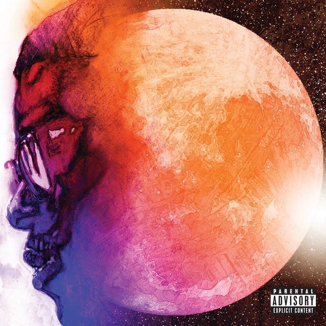
Kid Cudi - Man on the Moon: The End of Day (2009)
The most charitable interpretation of this art is that it’s the perfect visualization of Kid Cudi’s debut album’s outer space, futuristic aesthetic. It both conveys his lonerism and self-reflective nature, and the music’s spacey and atmospheric production. Cudi compares his alienation to literally being a man on the moon, above but away from everyone else.
The least charitable interpretation of this art is that it’s a corny rendering of the album’s title - my man literally mashed his face into the side of the moon and called it a day. (And nite.)
Either way, something about the pink-purple-orange colour combination in the image just does it for me. (You’ll notice this theme a lot.) The deluxe edition cover goes hard too. This album blew my mind when I first heard it in 2015, and the cover just kind of stuck with me as a reminder of good times.
Favourite song: Pursuit of Happiness (Nightmare)
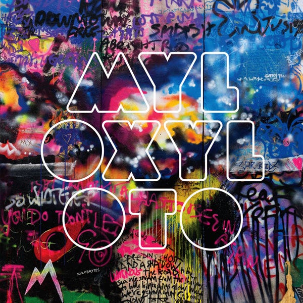
Coldplay - Mylo Xyloto (2011)
Talk about mind blowing. What the hell is even going on here? A fascinating mishmash of vivid colours and dazzling graffiti adds up to this gorgeous, maximalist visual feast. Upon release, Mylo Xyloto was criticized for being overproduced, and somehow that’s exactly what the cover looks like, for better or for better. It’s utterly glorious.
Mylo Xyloto is also one of the only two music CD’s I’ve ever purchased, the other being Linkin Park’s Living Things. I always liked Coldplay, but never enough to buy any of their stuff, but as soon as I saw this cover I just had to have it. And yes, the art looks as good if not better on a CD.
Favourite song: Charlie Brown
Chance the Rapper - Acid Rap (2013)
Look at those glorious shades of pink and purple and orange! Look at the constellations in the sky! Look at Chance’s bemused expression and tastefully stained undershirt! He looks like he’s an alien who just apparated into the middle of a forest at sunset, and is about to spit bars that take you into another dimension entirely.
Acid Rap gets plenty of acclaim, but to me it never quite lived up to what its cover promised. There was just something so fresh about its art.
Favourite song: Favourite Song (feat. Childish Gambino)
Vampire Weekend - Modern Vampires of the City (2013)
A hauntingly beautiful photograph of a smog-covered New York City skyline from the 1960’s complements the ethereal, transcendent beauty of what is frankly one of the greatest albums ever made.
Favourite song (which is actually my all time favourite song): Step
// Unheard Albums (Interlude)
I’ve only included three albums on this list that I haven’t actually listened to. Hence the occasional use of “most popular song” instead of “favourite song” below. But these covers were so captivating that I felt they deserved to be here, even though I hadn’t listened to the accompanying music.
Todd Terje - It’s Album Time (2014)
The cover for It’s Album Time gives off a contagiously fun, vacation-y vibe that I haven’t really seen anywhere else. (The cover’s illustrator also designs art for The New Yorker.) I love the drawing style, the angle (for lack of a better word) of the picture, the generous use of colour, and the way the title and artist’s name are both squeezed perfectly inside the image. It’s not just album time, the cover seems to say: it’s It’s Album Time time.
Most popular song: Delorean Dynamite
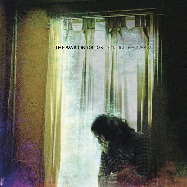
The War on Drugs - Lost in the Dream (2014)
This is, literally put, a photo of a man standing in front of a window, but it’s so much more than that. It has an air of intangible wistfulness. It feels like a scene straight out of a Márquez novel.
There’s something about the warm hues of yellow, green, blue, and maroon that give the image a mystical, celestial vibe, as if the room itself were filled with melancholy. Any album called “Lost in the Dream” should look exactly like this.
Most popular song: Under the Pressure
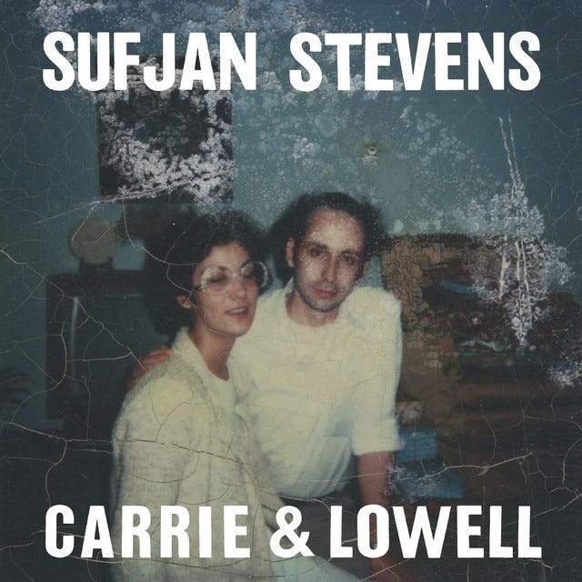
Sufjan Stevens - Carrie & Lowell (2015)
Have you ever held a decaying, decades-old photograph of a family member between your fingers and had the soul crushing realization that you and everyone you know will grow old, die, and eventually fade away, and that the waves of time spare no one and swallow us all into the ether?
No…? Oh yeah, me neither, hahaha.
An album as mournful and somber as Carrie & Lowell needed a cover like this. It’s a reminder of people and times long lost. You’ll look at it anew after actually listening to the album in its entirety, which you should. It’s also one of the two entries on this list that isn’t really cool or beautiful in any way. I think that’s kind of the point.
Favourite song: Death with Dignity
Tame Impala - Currents (2015)
A gorgeous design and an ingenious usage of colour combinations adds up to a cover that is like no other, and yet somehow looks exactly like its album sounds.
I really just have one word for this art: Iconic. Awesome. Incredible. Okay, I couldn’t do just one word. But some things speak for themselves. The less I say the better.
Favourite song: The Less I Know the Better
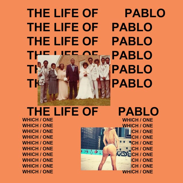
Kanye West - The Life of Pablo (2016)
a) This cover looks like it was carelessly put together in MS Paint by a twelve year old ten minutes before the album’s release.
b) This cover is intentionally disorganized and is actually a masterclass in simplicity, wonderfully showcasing the duality presented throughout the album.
Which / one?
With Kanye, you can never really tell. It’s a bit of both. The image probably was made in Paint. But what gets me about it is that it perfectly represents the controlled chaos, the intentional disarray of sounds and themes that is The Life of Pablo. It’s one of those covers you simply can’t appreciate without listening to the music.
The prevailing interpretation of the album - and it’s a generous one, for sure, but one I agree with - is that the album is basically a dichotomy between Kanye’s desire for the hedonistic, “plastic” life usually glorified by hip-hop, and his desire for a simpler life as a Christian family man. Both of these are symbolized by the two photos on the cover.
The tracklist and lyrics appropriately constantly shuffle between these two sides of him, often following Christian sermons with club bangers. This duality is best exemplified by Father Stretch My Hands, a song whose lyrics could not be further from the title.
The album constantly oscillates between Kanye struggling with different identities of himself and expressing this inner conflict through song. The “which / one” question on the art repeatedly asks us - which Pablo is he channeling now? Escobar? Picasso? Paul the Apostle? There are no clear answers.
(There is one theory that says that the forward-slash in between ‘which’ and ‘one’ is a reference to Kierkegaard’s 1847 book, ‘Either/Or’, which also talks about two similarly contrasting ways to live life.)
Needless to say, this cover is not easy on the eyes. But it is calculatingly haphazard just like the album it represents, and a memento of the last time it felt like Kanye truly cared about a record he put out.
Favourite song: Ultralight Beam
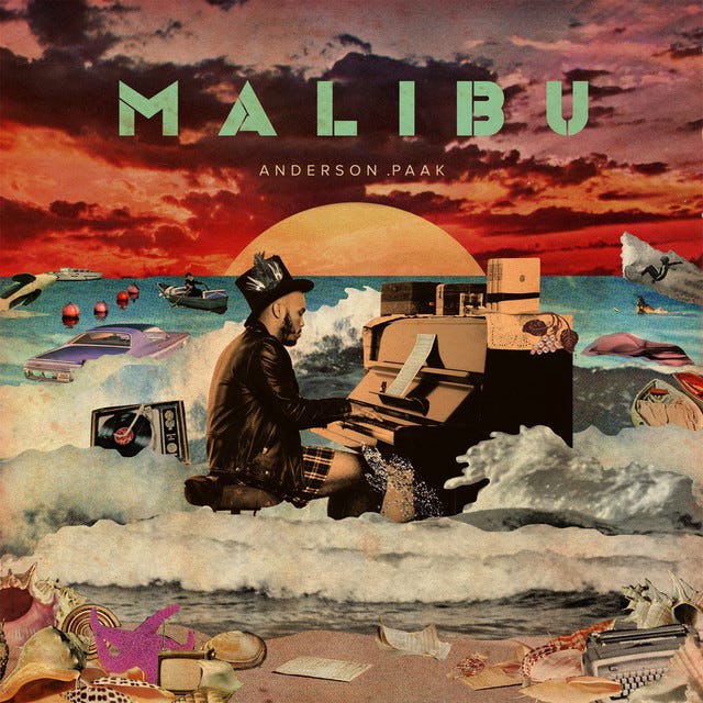
Anderson .Paak - Malibu (2016)
You know how the literal description of most covers sounds boring till you actually look at them? Yeah, this isn’t one of those. Here, Anderson .Paak, wearing a hat, jacket, and boxer shorts, plays a piano among waves on the seashore during a dazzling red sunset, while various objects float around him in the water. The objects include a typewriter, a car, a boat, a record player, a starfish, and some books and seashells.
This is a description that reads better than most covers even look. Need I say more? This is one of those images that make no sense and it doesn’t need to. It’s a testament to the power of imagination itself. It’s the stuff dreams are made of.
Most popular song: Come Down
// Do Subscribe (Interlude)
Lorde - Melodrama (2017)
This is a devastatingly beautiful painting in and of itself, but it somehow works even better as the cover for Melodrama. The warm flush of yellow light that lands on Lorde’s face, after seeping through the despondent blue glow of her surroundings, somehow perfectly captures the anguish, heartache, hope, and euphoria of this utterly flawless record.
Favourite song: Hard Feelings/Loveless
Kids See Ghosts - Kids See Ghosts (2018)
Kids See Ghosts was a hip hop duo formed by Kanye West and Kid Cudi in 2018. It was a fusion of two artistic styles. So it feels appropriate that in so many ways, the cover for their self-titled debut album is itself an amalgamation of so many others already listed above.
First off, it showcases the most mind-obliteratingly-stunning colour combination I’ve seen since Is This It.
Second, it was created by Takashi Murakami, the same Japanese artist who designed the sublime Graduation cover.
It then has similar pink-orange-blue background undertones to the ones Cudi used on Man on the Moon.
Like the cover of Malibu, it makes no logical or thematic sense, but nobody really cares when the result is this imaginative.
And like Acid Rap, the album itself never quite lived up to the image.
But what an incredible image, really.
Favourite song: Reborn
Kid Cudi - Man on the Moon III: The Chosen (2020)
Kid Cudi strikes yet again, and this time with the most eye catching cover on the entire list. (Just look at it!) This image is so striking that it easily stands out even as a thumbnail in a playlist.
And for good reason. The word “trippy” was invented specifically to describe drawings like these. It is detailed, gorgeous, and thematically apt, ingeniously depicting Cudi’s internal struggle against his evil alter ego that is present throughout the album. It defines a psychedelic dreamscape on which the album can take place. It’s a gateway to the spectral, otherworldly abyss that the album attempts to create, but I suspect it achieves this goal better than the music itself.
Favourite song: Lovin’ Me (feat. Phoebe Bridgers)
Mac Miller - Circles (2020)
If most covers mentioned above (especially the one before this) stand out because of their intricate design and distinctive use of colour, the Circles cover here is equally arresting while being on the opposite end of the design spectrum. Devoid of almost all colour and employing no fancy in-your-face detailing, it’s a masterclass in the power of simplicity and minimalism, of doing more with less. Somehow that makes it even more impressive.
An arresting image is created simply by superimposing two of Mac’s portraits over each other in black and white. There’s just something about the result that’s hypnotic and powerful, arguably in huge part because the album was released posthumously, and this portrait acts as a final respectful ode to an artist who passed away too soon.
Favourite song: Hand Me Downs
// Outro
And those were all my favourite covers! It does seem suspect that I didn’t choose a single album released before the 21st century, but that’s just because nobody made great album art in the pre-internet era. The art of making good covers seems to have emerged only in the last two decades, as visual artists have had access to greater computing power and better software tools.
Sike! I kid of course. It’s just that I haven’t heard very many albums from before 2000, and so I never found any art that resonated with me. Though if I absolutely had to add one pre-2000 cover to the list, it would be that of Nas’ Illmatic. All that being said, I do hope this changes, and that I continue to explore new music instead of listening to the same old Linkin Park songs for the 249th time.
// Bonus Track
They say don’t judge a book by its cover
But for music that just ain’t true
I’ve seen covers of such baroque splendor
They helped me see the music anew









Loved this!
Im actually amazed the list started with my all time favourite album cover - but it was a different version of the cover! The naked woman white on white is just perfect for the vibe of the album, and looks good enough to hang on your wall.
The version I'm talking about: https://en.wikipedia.org/wiki/Is_This_It#/media/File:The_Strokes_-_Is_This_It_cover.png
Great list though man!